A B2B learning technology company that delivers the industry’s most powerful Personalized Skills Practice solutions, helping learners and organizations maximize their value.
The Regis Company partnered with The Label Collective to redefine its brand persona and refresh its visual identity, shifting its focus from consulting services to offering its SimGate™ Skills Practice Platform as a standalone product.
CHALLENGE
The Regis Company needed its brand identity to better support its SimGate™ Skills Practice Platform. Their existing brand and website did not effectively communicate their recent shift from a service provider to a SaaS offering, which hindered their ability to present and communicate a unified product between their internal teams.
SOLUTION
The Label Collective partnered with The Regis Company to deliver a comprehensive brand refresh. This included updating their brand message to be more conversational, developing a new aesthetic with a shift to illustration-focused visuals, and creating a Figma Brand Asset Library. The main features of the product were brought forward through the use of agnostic screen views and infographics to simplify more complex concepts.
RESULT
The refreshed brand identity successfully aligns with the spirit of the customers that see SimGate as a viable L&D option. The updated website now clearly communicates product value, and the Figma Brand Asset Library ensures brand consistency across all of the internal teams. Since its launch, the unified approach has improved brand continuity, received positive employee feedback, and strengthened The Regis Company’s market position.
Brand Strategy
By conducting interviews and research with the internal team, The Label Collective aligned with The Regis Company on a new, forward-thinking brand persona.


Verbal Identity
Once the brand persona was identified, content was revised to reflect the new product and direction.
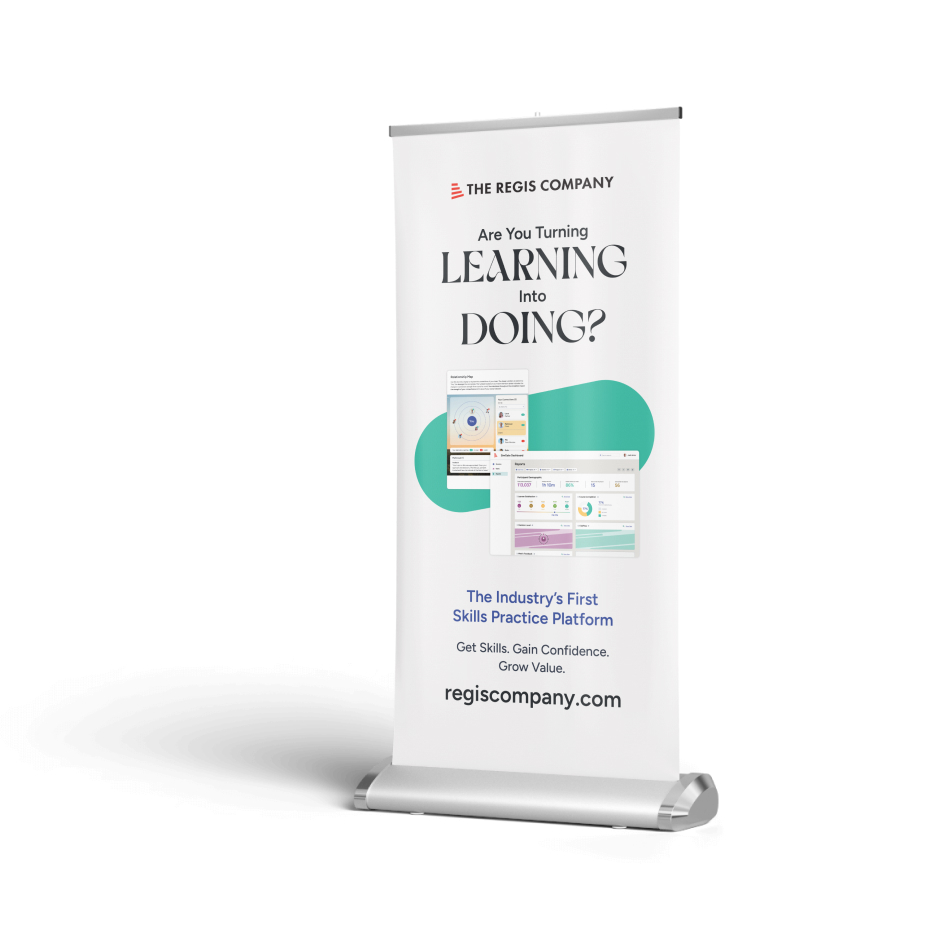
A new tagline now highlights the potential that the SimGate™ Skills Practice platform brings to learners.


Visual Identity
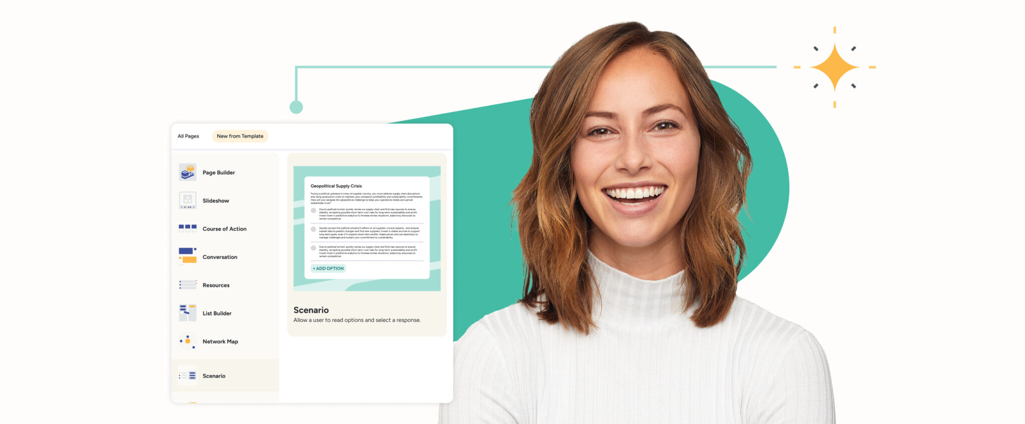
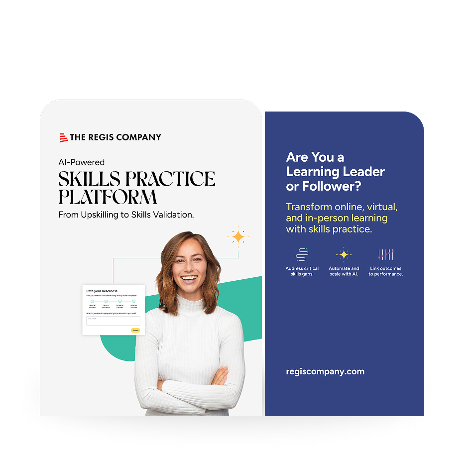
While the logo remained the same, there was a desire for the visual language to feel more current and modern in the market — much like their competition. The previous identity felt more like a “consultant;” the new direction needed to feel like a “product.” Therefore, the product was brought forward so customers could envision how SimGate could help them. People were brought into the story with a purpose, and often reflect learners or designers.


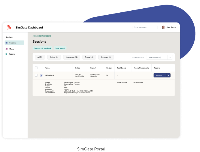
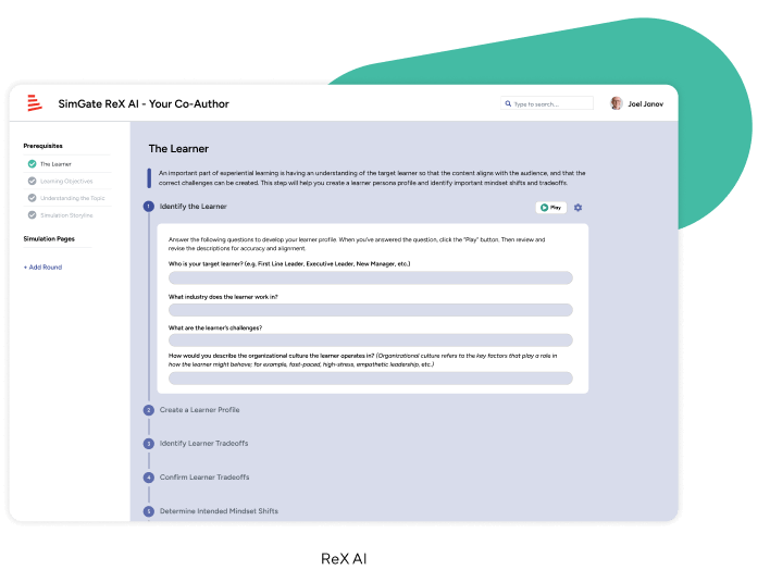
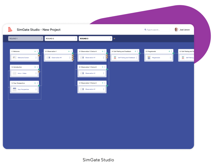
Different functions of the SimGate Skills Practice Platform were given their own primary colors to quickly separate creative vs. administrative roles.
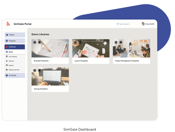
Website
Their updated website more clearly communicates product value to prospects and partners.


Brand Deliverables
The most valuable part of their brand refresh was the library of visuals, icons, and branded Product UI illustrations that help tell their story. A Figma asset library was created along with brand guidelines that Sales, Marketing, and Product teams can all sync and reference for their work.
The value of illustrations
For the first time in the life of the new product, diagrams were created to help prospective customers understand exactly how scalable SimGate is.


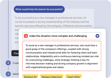
Show the magic of the product first
Product interfaces — and smaller illustrations derived from smaller interactions — provide a scalable way of showing specific features of the platform. This gives the brand flexibility to demonstrate product without overwhelming the viewer.


WORK WITH US
Let’s start building your brand’s unique story together.
Want to see the difference a strong brand can make? Reach out to us today for a consultation.
Get in Touch

