Tailored coaching, advisory, and learning services that foster inclusive and equitable environments.

The Inclusion Practice reached out to The Label Collective to assist with creating a refreshed visual identity and website that more accurately reflected the growth of their company and its future goals.
CHALLENGE
The Inclusion Practice, a consultancy dedicated to fostering inclusive workplaces, needed a clear and impactful way to communicate their services and the transformative benefits of their work to organizations seeking to build more equitable and engaging environments for their employees.
SOLUTION
The Label Collective partnered with The Inclusion Practice to develop a visual identity and website that clearly articulates their expertise in diversity, equity, inclusion, and belonging (DEIB). We focused the design on highlighting tangible outcomes of their consulting, training, and coaching services, such as increased belonging, improved employee engagement, and the cultivation of more equitable workplaces.
RESULT
The website now effectively conveys The Inclusion Practice’s value proposition, clearly outlining their services and the positive impact they have on organizations. By focusing on tangible benefits and a tailored approach, the visual identity resonates with businesses looking to create more inclusive and thriving workplace cultures, ultimately driving engagement and potential client interest.
Logo
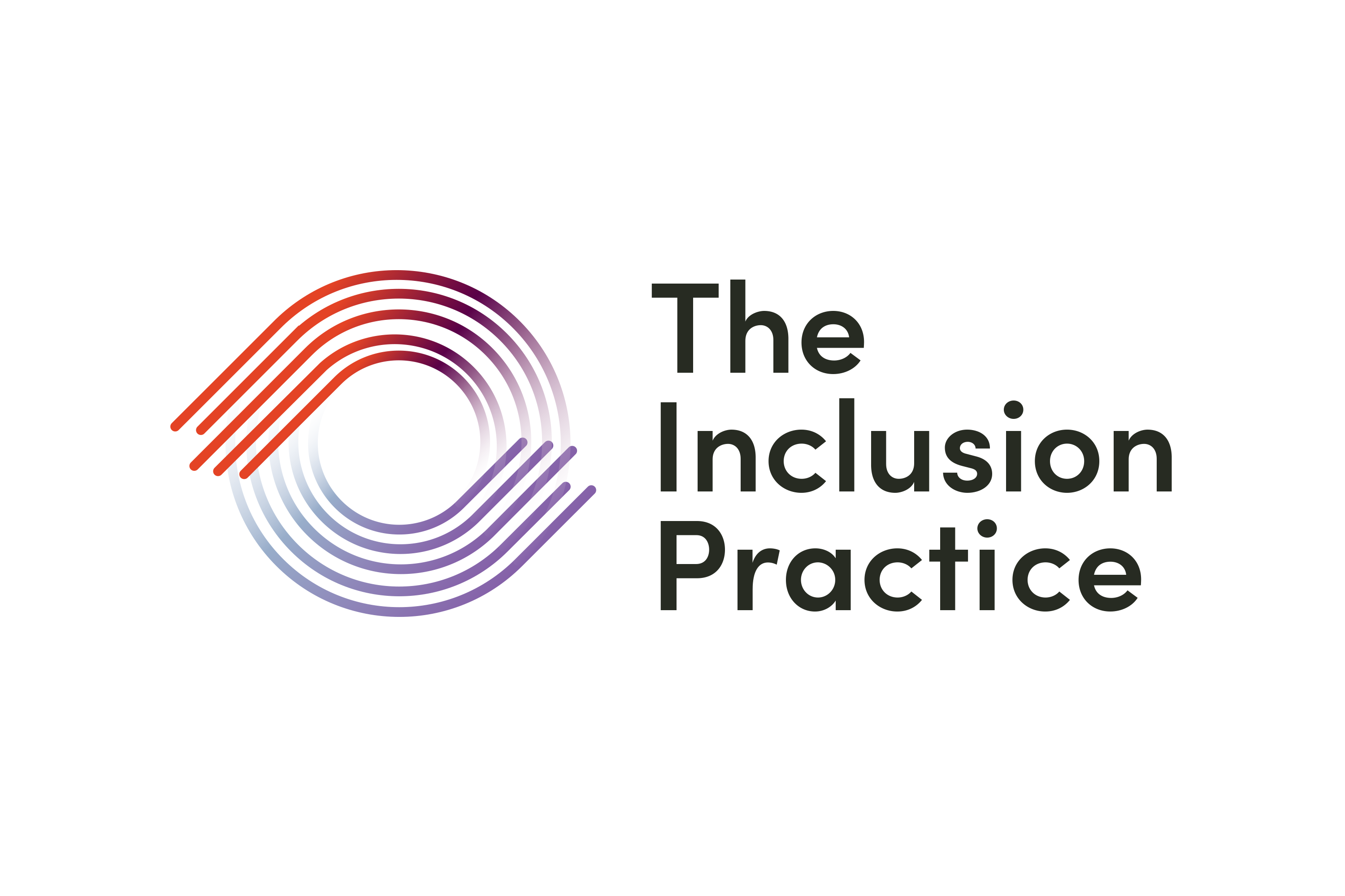
The final logo mark was inspired by the concept of continual change and movement, as well as the journey that The Inclusion Practice supports its clients with. Using colorful, flowing lines, the reds and blues combine to create purples, signifying “new opportunities.” The font in the wordmark is a humanist sans-serif that isn’t too sharp or punchy.


Visual Identity
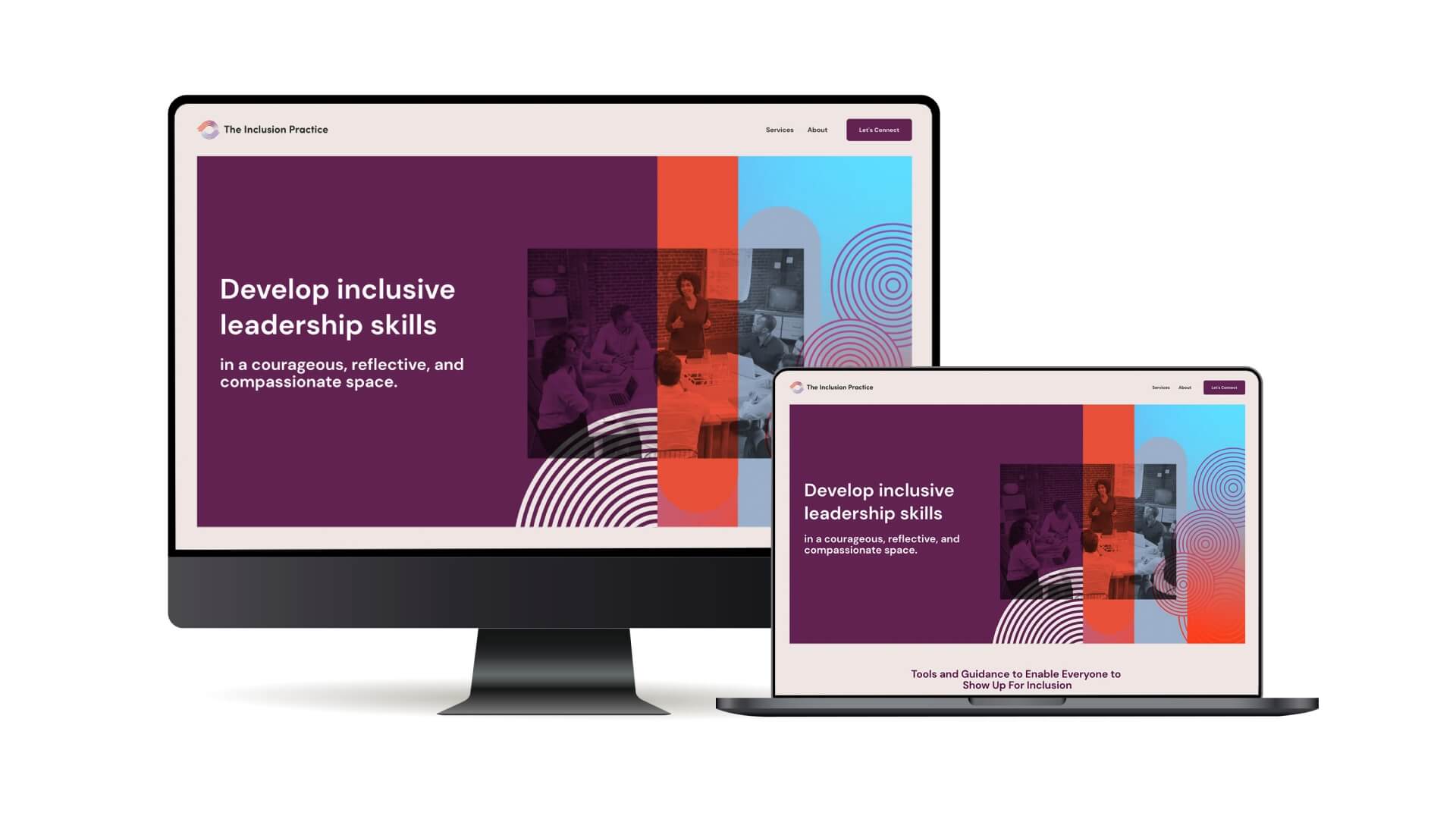
The majority of the visual identity carried the idea of “flow” through from the logo mark. A primary gradient was created to support the color palette and offer up a more dynamic backdrop. Photography choices convey “motion” and should only be used as backgrounds. Custom geometric illustrations were created to help designate between The Inclusion Practice’s different service offerings. A basic Brand Guidelines document was also provided.


Website
The main focus of the site design was on function, but the styling of the site was focused on accessible palettes. Supporting visuals were created to be bold, but not flashy. Solid blocks of color were used to draw the viewer’s eye into the page. Content areas retained high contrast for legibility and easier scanning.


WORK WITH US
Let’s start building your brand’s unique story together.
Want to see the difference a strong brand can make? Reach out to us today for a consultation.
