A policy-tracking platform that uses artificial intelligence to make policy creation more transparent, responsive and inclusive. It enables organizations to easily sift through the overwhelming amount of updates that happen during legislative sessions, making research smarter, faster and less expensive.

The Label Collective worked with Plural (formerly Civic Eagle) to expand upon the brand strategy and identity developed by New Kind into its website, social, and marketing materials.
CHALLENGE
Plural, a dynamic tech company, sought to launch its innovative suite of products with a powerful brand presence. They needed to cut through the noise of a crowded market and establish themselves as a clear leader. Their challenge was to develop a brand identity and launch strategy that would resonate with their target audience, effectively communicate their unique value proposition, and generate significant market traction.
SOLUTION
Plural partnered with The Label Collective to craft a comprehensive brand activation strategy. This involved a deep dive into Plural’s unique perspective to illuminate their core differentiators within the brand and on their new website. A compelling visual identity was developed that brought Plural’s altruistic spirit and commitment to transparency in data (and government) to the forefront.
RESULT
Plural’s brand activation was a resounding success internally. The launch generated positive market reception, and the website not only reduced product confusion but was also built to scale and grow with any added capabilities. With the completed brand identity, Plural was now able to shift its time and focus from consistently communicating the product to generating new lead gen materials to help find prospects faster.
Brand Strategy
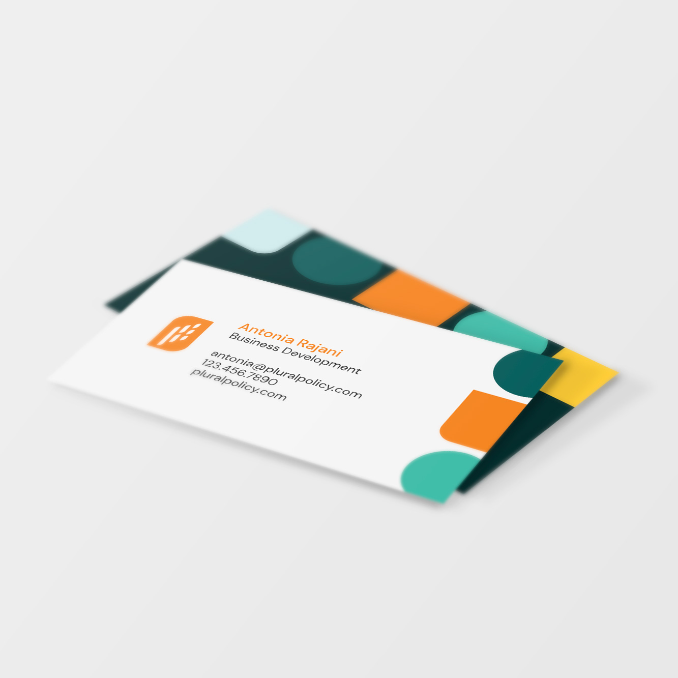
With the logo and color palette already established, the next step was to bring the rest of the brand to life. The shape of the Plural “Flag” logomark inspired a bold and colorful design that subtly reflects Plural’s purpose.

Visual Identity
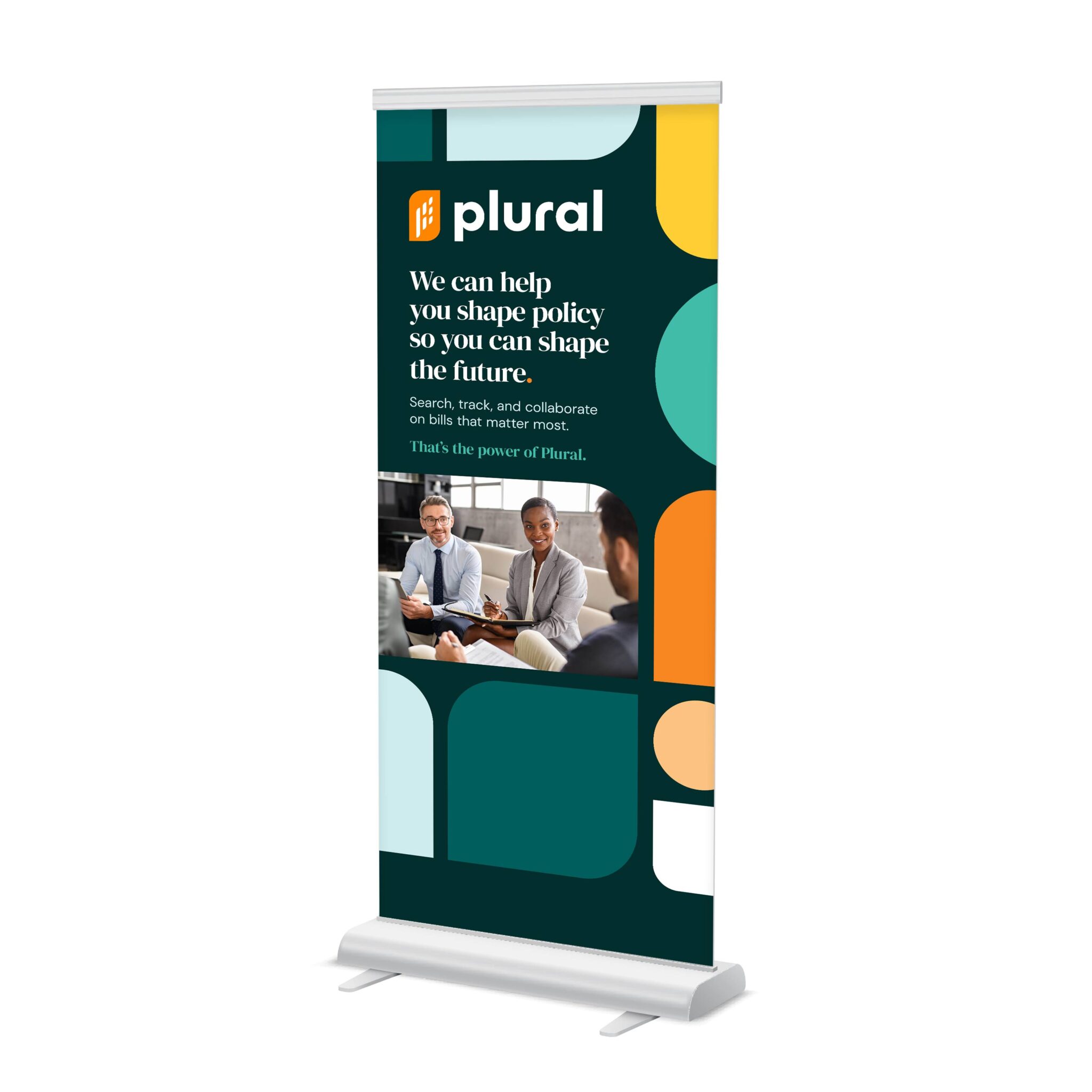
Government services often come across as rigid and structured, so we established grid rules to create a reusable template for patterns derived from various shapes. However, the application of these shapes and colors was customized for each specific instance. This approach resulted in a larger set of visual interpretations that remained true to the brand while still feeling distinct.
In order to expand on the strategic use of the flag shapes, outlines were introduced as a way to feature highlighted images. Additionally, tinted shapes became a way to provide a richer backdrop behind device images and screenshots.
The original brand utilized only sans-serif fonts. To improve content hierarchy and better align with the Government audience, a serif font was added to use for headlines.


Website
The website needed a creative overhaul, as well as being migrated from Squarespace and rebuilt in WordPress to allow for more scalability. The new brand was applied to the site, and wireframes were produced to help validate any new page designs that had major traffic.


Brand Deliverables
Due to the name change, Plural launched its brand in a “light switch” manner. Individual creative assets all needed an update before the announcement, and the updated website went live. With an event two weeks post-launch, booth designs, social media profiles, and online announcements of the new name were first priority. The best-performing marketing materials also received a facelift to retain brand consistency.


”The quality of design was amazing, and their approach to gathering stakeholders' feedback was great.
Carrie FisherVice President of Marketing, Plural
WORK WITH US
Let’s start building your brand’s unique story together.
Want to see the difference a strong brand can make? Reach out to us today for a consultation.
