ePatientFinder was a Clinical Trial Exchange technology platform and referring practice network that helped physicians connect with their patients and obtain information on treatment options.
ePatientFinder approached The Label Collective to create the next iteration of their brand and visual identity.
CHALLENGE
ePatientFinder, a company connecting patients with clinical trials, needed a brand identity that conveyed both innovation and trust. They required a professional yet approachable visual system that would resonate with healthcare professionals, researchers, and patients seeking treatment options.
SOLUTION
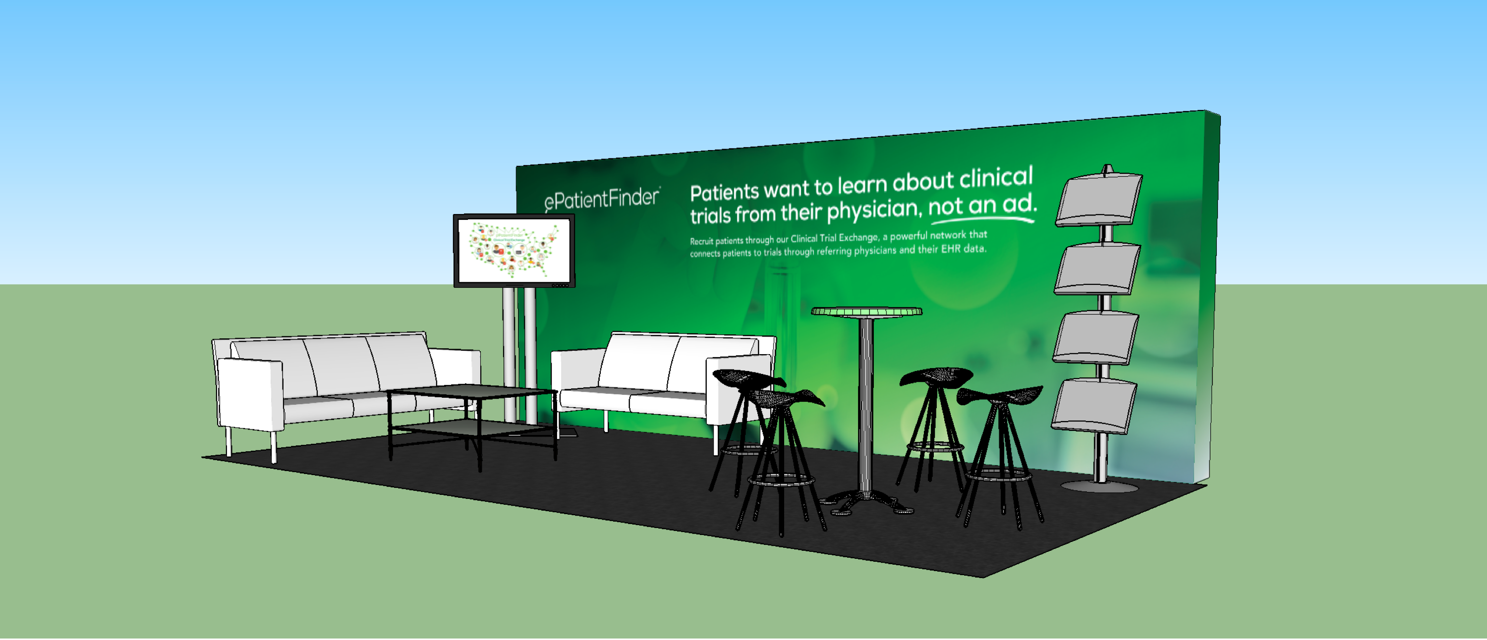
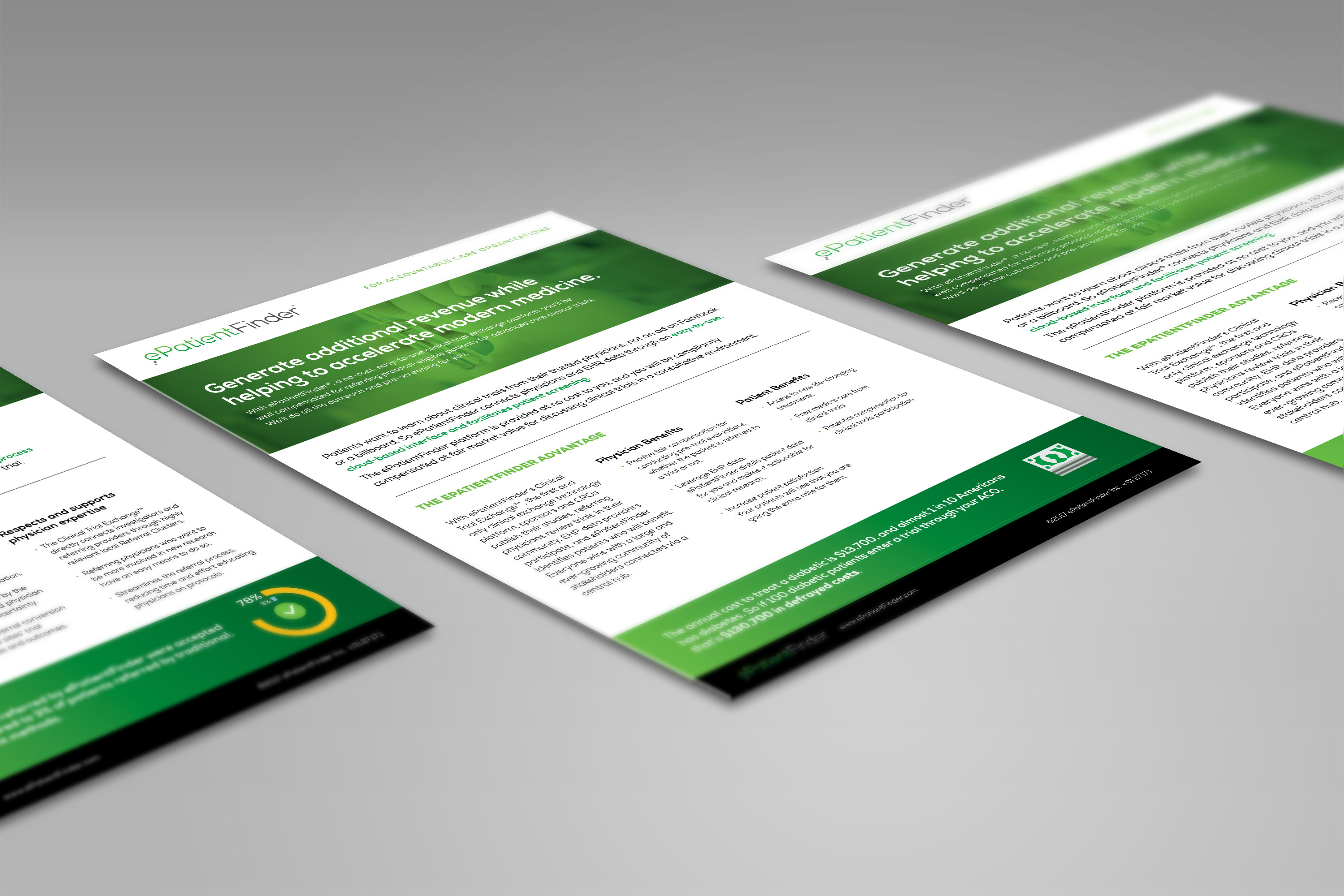
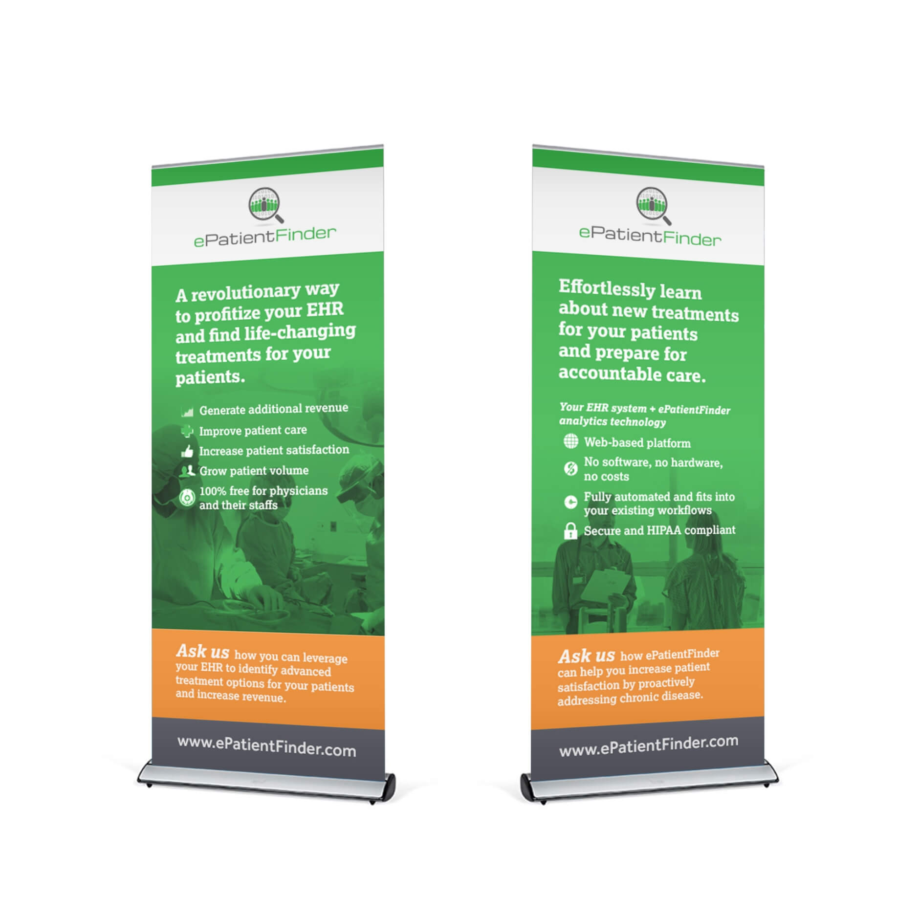
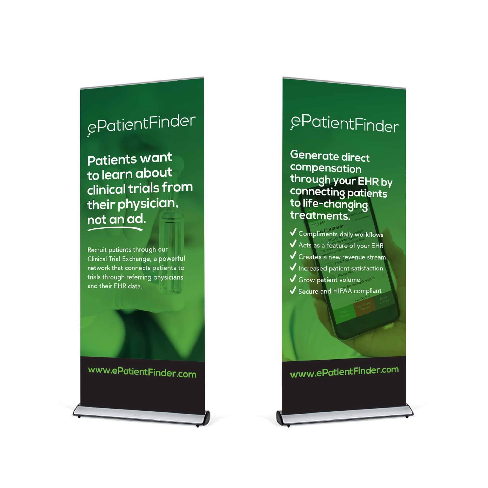
The Label Collective developed a clean and modern brand identity for ePatientFinder. This included a sophisticated logo, a discernible color palette, and clear typography. The design aimed to communicate reliability and progress, reflecting ePatientFinder’s commitment to advancing medical research and improving patient access to clinical trials. The visual identity was extended across their website, print and digital collateral, and tradeshow booths.
RESULT
The resulting brand identity successfully positions ePatientFinder as a credible and forward-thinking company in the healthcare technology space. Its professional and approachable design builds trust with its various stakeholders and effectively communicates its mission of connecting patients with vital clinical research opportunities.
Logo
The updated logo for ePatientFinder was based on two goals: to make the company look more professional and approachable. The current logo was overly busy with data that didn’t read well in small use cases, so the original concept was refreshed to remove it. A geometric font replaced the blocky, technical font of the original choice.


Visual Identity
The original visual identity relied heavily on grays and whites with the other color values as accent. In the new look, the green is brightened and becomes the hero color for all creative. The fonts complement the new logo while prioritizing legibility. Environments and textures alluded to modern medicine and supported the theme of clinical trials in a very intentional manner.

Website
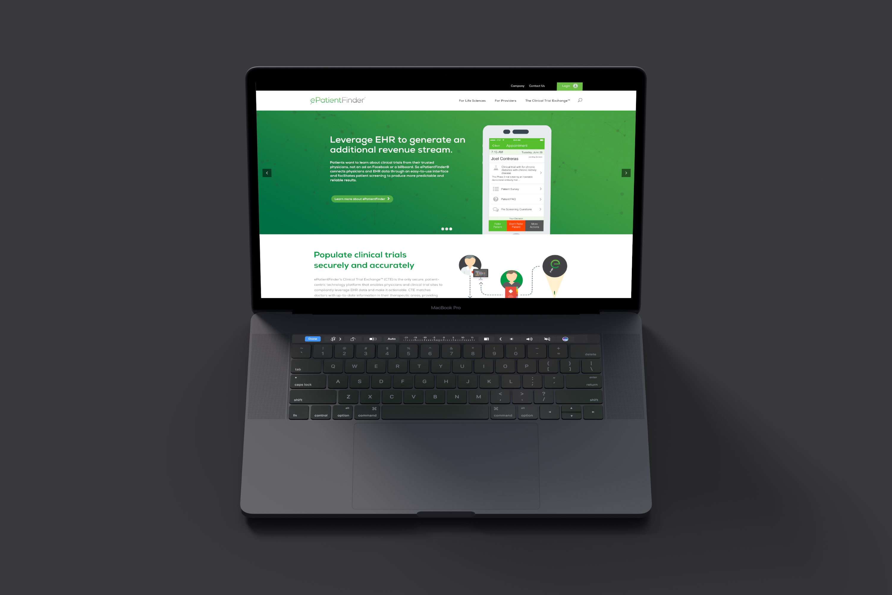
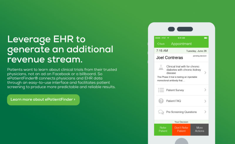
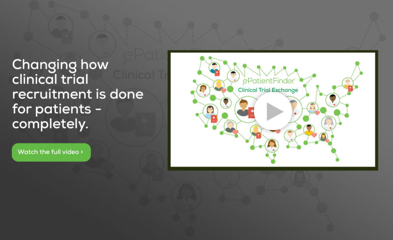
ePatientFinder was transitioning from a startup, brochure-style website to one that better suited their marketing and sales needs. Content was restructured and redefined to fit the new direction. The new visual identity placed greater emphasis on their homepage hero to draw the user in.

Brand Deliverables
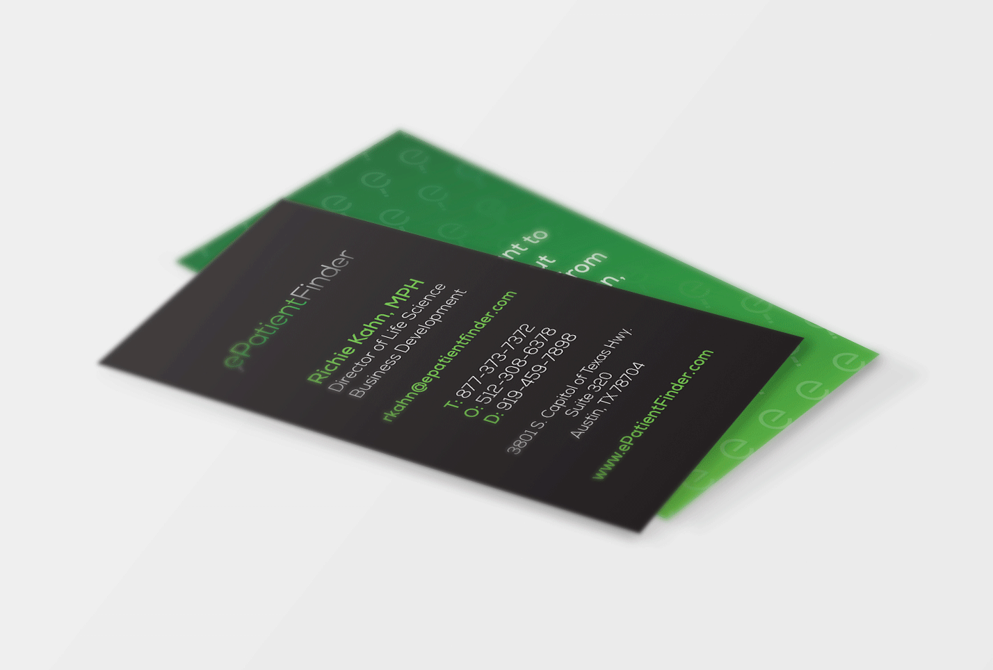
The new visual identity extended into their sales and marketing materials, giving them a clean, professional look. Soon after, the new brand was showcased at upcoming trade shows and events.


”I've worked with multiple marketing firms, and The Label Collective is one of the few that actually meet deadlines on their deliverables. They have a great project management approach that actually works and helps keep our internal team on track.
James FosterVP of Marketing and Sales Solutions, ePatientFinder
WORK WITH US
Let’s start building your brand’s unique story together.
Want to see the difference a strong brand can make? Reach out to us today for a consultation.
