Partnering with the #1 platform for WordPress to consult on their corporate brand refresh and develop a highly usable, Figma-forward direction for their brand system.

The Label Collective and WP Engine collaborated on a strategic vision that would help deliver their first corporate identity update to the market in nearly 6 years.
CHALLENGE
WP Engine’s business had expanded, and multiple acquisitions needed to be merged into a cohesive brand that was approachable and scalable. To accomplish this, they needed a strategic partner to help align their new brand voice with a refreshed visual identity. In the end, all brand materials needed to be centralized, and their brand guidelines needed to be updated to ensure the alignment of its internal teams and partners.
SOLUTION
The Label Collective collaborated with WP Engine’s internal Brand team inside of Figma to design, build, and implement a comprehensive Brand Component Library and framework that serves multiple departments.
RESULT
WP Engine’s new visual direction reinforces its elevated position as a multi-product SaaS company, offering a scalable platform for developers, designers, and agencies to build, scale and optimize their website online using WordPress.
Brand Strategy
WP Engine’s logo mark has been historically perceived as the “engine” that powers the presence of anyone who chooses to build and host on WordPress. Each shape within the logomark is a “cog” that powers websites and keeps them running. Focusing on the cog shapes as unique brand elements allowed the brand to remain present in product updates and illustrations. Lighter, brighter colors mixed with dark accents and intentional gradients gave the new brand identity a more focused direction, and custom color palettes helped visually guide customers through the suite of WP Engine products, tools, and plugins.


Logo
WP Engine wanted to address specific updates to the logomark. The current logomark had strong brand equity, so attention was turned towards refinement instead of reinvention. The history of the cog mark needed to be preserved, and the acquired and internal brands needed to be visually aligned to show their interconnectivity. Accessibility concerns and scaling of the logomark across digital applications were also highly important to address.
The end result rounded the corners of the cog to make it more friendly, balanced the center shape, and expanded the white space between the individual cog shapes so the logo would scale appropriately. A new font was established that increased the weight from the previous version.
Visual Identity
WP Engine will also be able to make future visual updates within the individual libraries and publish them company-wide on a regular cadence. The new brand component library acts as an evergreen system that will continue to scale as the need for new visuals and product offerings grows.
Illustration Guidance
The Label Collective created a system to scale illustration elements up and down based on their use case and prominence in the sales funnel. Pre- and post-purchase visuals were considered, with people and product being the main focus.
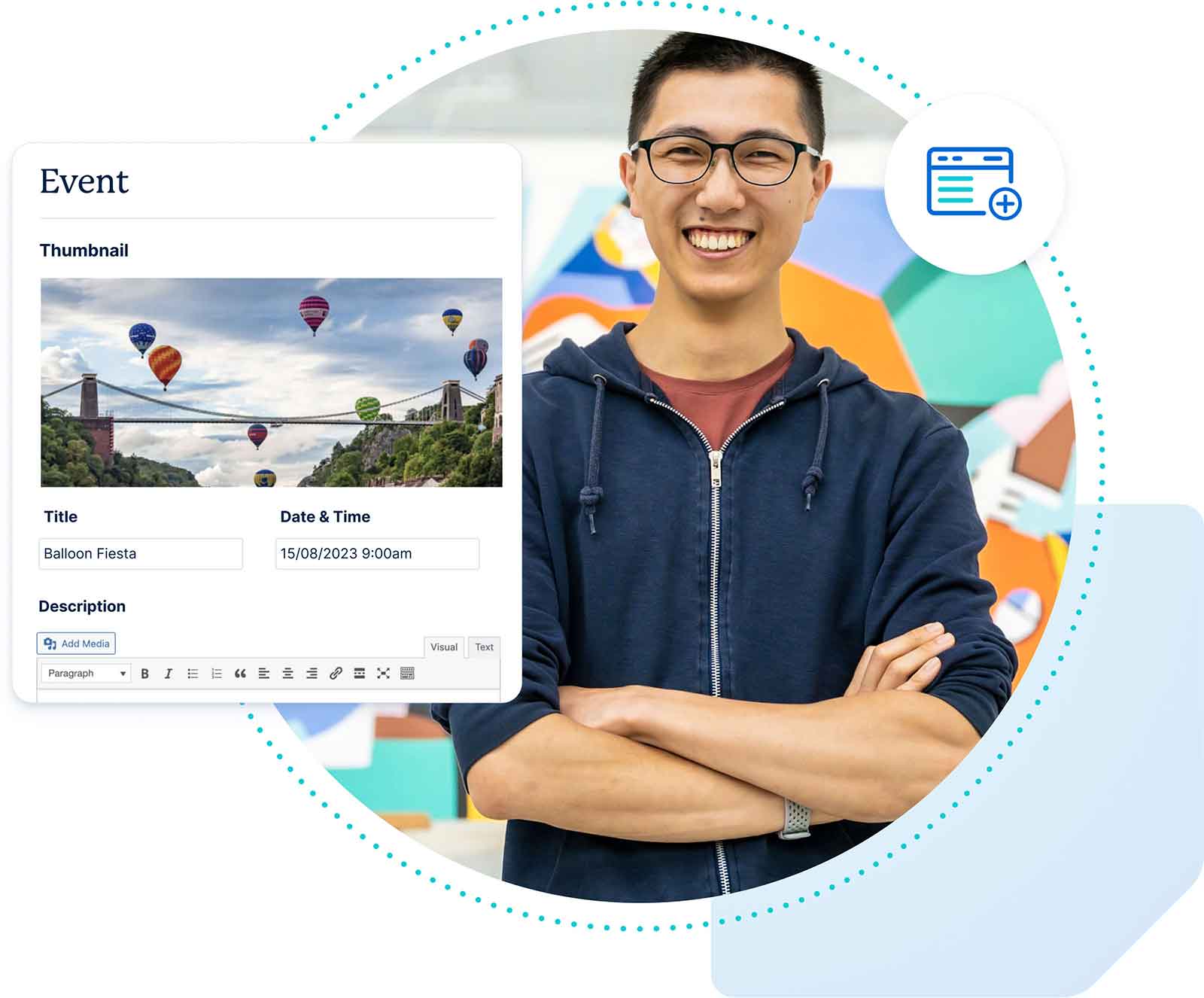
Use a cog shape as a ownable, branded, recognizable backdrop to the illustration.
Include a snippet of the user interface (UI) that supports the theme.
Add a proof point – a statistic, icon, or product review – that pays off the overall message.
Use a people-focused lifestyle image that represents the end user.
“We are proudly showcasing the brilliance and passion of the people behind our products and technology with fresh, modern photography.”


”The Label Collective team was extremely strategic, logical, and process-driven, especially when it came to bridging the gap between brand strategy and creative execution. They have been a great collaborative resource throughout our brand system pitch and rollout process.
Regina YuanDirector of Brand, WP Engine
WORK WITH US
Let’s start building your brand’s unique story together.
Want to see the difference a strong brand can make? Reach out to us today for a consultation.
Get in Touch

