
Creative Direction, Art Direction, Design, Social Media Design, Brand Strategy, Creative Strategy, Brand Identity, Content Strategy, User Experience, Website Design, Website Development, Illustration, Copywriting, Infographics, Presentations
Maturing a healthcare savings company with a refreshed logo, brand identity, and messaging strategy to enhance their market presence.
The Label Collective collaborated with RazorMetrics to elevate their brand’s visual and contextual standards and clarify their healthcare technology.
TLC PARTNERS
Brand Messaging: WAXX Creative
Creative Collaboration: DeSart Studios
End Results
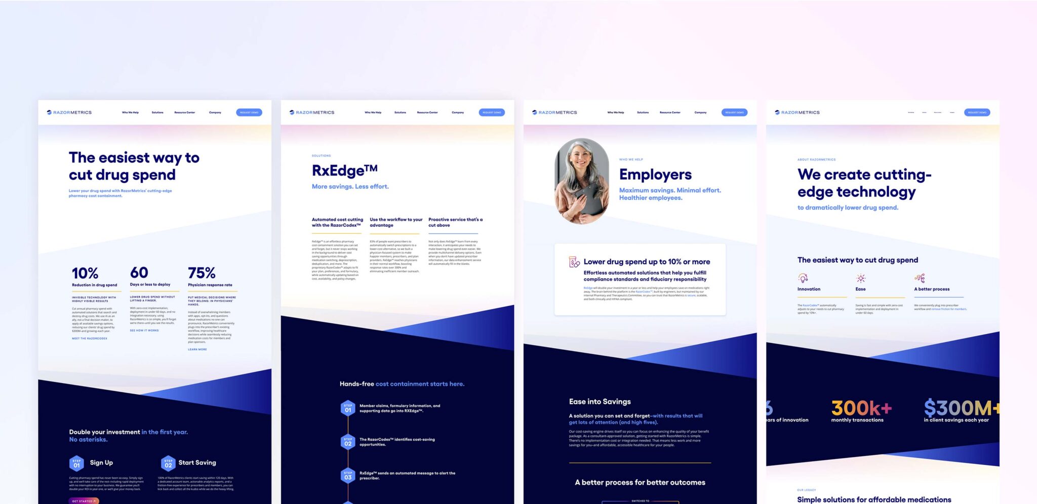
With a simplified message strategy and sharper brand, RazorMetrics can now effectively utilize its new logo and identity to consistently communicate about its offerings and reinforce its position as an industry leader. Their updated website clearly illustrates how each of their targeted audiences benefits, all while maintaining an easy-to-understand tone for potential customers.
Brand Strategy
RazorMetrics’ previous visual identity was bold and intense, primarily using muted blues and oranges in its illustrations and icons. The new brand persona allows for brighter colors and a lighter, more breathable design while still being able to boldly proclaim its cost savings. Backgrounds were simplified and visuals were streamlined, focusing on diagrams and images that relate to the target audience.


Verbal Identity
RazorMetrics’ competitive set, as a whole, generally felt more clinical and dated. There was an opportunity to infuse a more engaging and authentically human brand voice into their communications to set them apart. Through creating mission, vision, and customer value statements, the brand achieved a north star to guide them through their future conversations and interactions.


Logo
The logomark is inspired by the concept of “Occam’s Razor” (referred to as “Metric Razor” in this context). Occam’s Razor is a problem-solving principle that when all things are equal of two competing theories, the more straightforward explanation should be preferred. The design of the logomark features a simple hexagonal pill shape with a clean razor slice through it, embodying minimalism and simplicity. It symbolizes both “slashing prices” and RazorMetrics’ ability to reduce prescription costs. It is paired with a clean, yet audience-friendly capped serif. The use of softer colors in the background helps balance the razors’ sharpness, creating a more approachable and empathetic feel.
Before

After

Visual Identity
While RazorMetrics isn’t directly in the medical field, the healthcare industry vertical tends to be saturated in some shades of blues and greens. While a dark blue was included to hint at the legacy RazorMetrics brand, more vibrant colors and a set of gradient palettes were added to differentiate it from the competition.


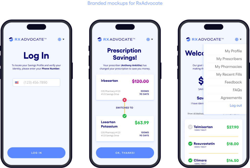
Website & App Concept
Along with the new brand styling, the website content needed to be heavily simplified, embodying the new brand tone and voice to be straightforward enough that “even grandma could understand it.”
Brand Deliverables
The new brand identity has extended into multiple sales enablement and marketing assets to help support their internal team.
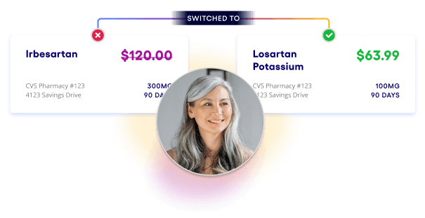
Supporting visuals
A single diagram can now help RazorMetrics demonstrate the full end-to-end process of saving on prescriptions through their RazorCodex proprietary platform, highlighting touchpoints where they, the physician, and the prescriber take action.


”The Label Collective stepped up to the plate to handle a tight timeline, where other agencies told us no. Results, Delivered.
James FosterVP of Marketing, RazorMetrics